Documentation:Interactive Orchestra
Introduction
Background
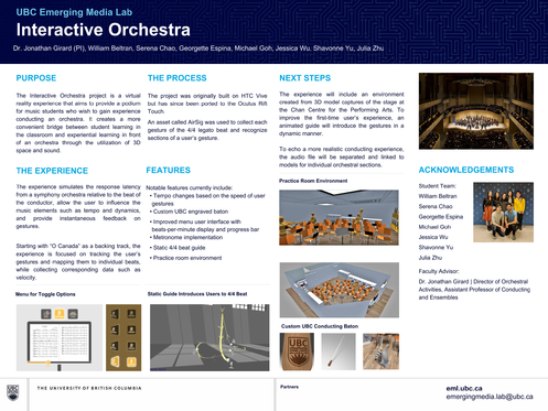
The Interactive Orchestra project is a virtual reality experience that aims to provide a podium for music students who wish to gain fundamental conducting experience in an orchestral setting. It creates a more convenient bridge between student learning in the classroom and experiential learning in front of an orchestra through the utilization of 3D space and sound.
The end goals of the experience is to simulate the response latency from a symphony orchestra relative to the beat of the conductor, allow the user to influence musical elements such as tempo and dynamics, and provide instantaneous feedback on gestures.
The project was originally built on HTC Vive and has since been ported to the Oculus Rift Touch.
The Experience
The experience simulates the response latency from a symphony orchestra relative to the beat of the conductor, allow the user to influence the music elements such as tempo and dynamics, and provide instantaneous feedback on gestures.
Starting with “O Canada” as a backing track, the experience is focused on tracking the user’s gestures and mapping them to individual beats, while collecting corresponding data such as velocity.
Current Features
- Music Tempo Control | Tempo changes based on the speed of the user’s conducting gestures. Gesture is dynamic and audio playback will change on every user gesture bpm change.
- Improved Menu | User Interface with toggle buttons and progress bar
- Metronome | For O Canada 4/4 Time Signature
- 3D Dynamic 4/4 Beat Guide
- Conducting baton plane ripple on every conducting gesture made.
- Chan Centre Environment (concert hall)
- Visual Playback of last conducting motion (user can gain perspective on their conducting strokes).
- Improved gesture tracing guide for learning the 4/4 baton motion.
Future Features
- Tutorial Scene for introduction to Interactive Orchestra (In Progress).
Approach
Prior to this project, UBC Studios created a 360 video of the UBC Symphony Orchestra performing a concert performance in March 2018. Dr. Girard approached the UBC Emerging Media Lab with the idea for this project. A student team has been working on this project since September 2018. In the beginning stages of the project, the team identified assets required for gesture tracking and audio manipulation, then delivered a Proof of concept in December 2018. It focused on the user's ability to slow down the music and bring the tempo back to the original tempo.
From Jan to April 2019 focused on improving the UI and added in UX elements such as a 3D guide with written tips and a metronome. A classroom environment was also implemented, but reverted as the assets could not be kept.
From April to Sept 2019 the team switched over to a new Chan Centre Environment and created a first solution on dynamic user gesture tracking and audio playback using a static Python based ML model and created an alternate mode where XML data can be generated from the user prep beat gesture path.
From Sept to Dec 2019 the team added in new improvements to UI through tweaking existing baton, bpm scroll and bpm display models and adding a new podium model. The ML solution to dynamic user gesture tracking and audio playback was abandoned for using a time difference based solution between the baton crossing the plane.
From Jan to April 2020 emphasis was on adding new user features such as the conducting record playback, which the user can press a button after conducting to view their exact gestures from different POVs. A toggle-able gesture tracing guide, which is an improved guide model showing a visualization of the 4/4 gesture that the user can trace with their baton, and the tutorial scene, an interactive guide that takes you step by step on the different features of the project and how to interact with them.
Design Findings/User Research
January 2019 - April 2019
Tutorial Sequence
The tutorial should have an intuitive ramping structure, in which you start with the most basic motion interactions (walking > grabbing objects > choosing menu options > conducting) and work your way up to more complicated interactions.
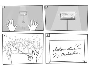
| 1 | Everything is dark, except for a music stand directly in front of you. A spotlight hits it from above, and on it is a baton. On the stage floor are footprints heading towards the music stand. |
|
| 2 | Walking forward, you hear the reverb of your footsteps echo throughout the large room. Stepping into the spotlight, the stand comes to life, showing you how to pick up objects. |
|
| 3 | Picking up the glowing baton, the lights fade in to reveal an orchestra in front of you while you hear the swelling sound of the orchestra tuning. | |
| 4 | “Welcome to… the Interactive Orchestra!” Sparkling cursive letters - written with a flourish - appear on the stand. The music stand lights up and presents menu options. |
Initial Pain Points
Questions:
- Should the baton be used to choose menu options, or the empty hand?
- Controllers as hands could be a good option, as it draws a closer analogy to what it would look like while you were conducting. Having hands instead of controllers makes buttons more approachable. Not many buttons on the controller are needed.
- How can we indicate when the user is conducting at the correct pace or at an incorrect pace? (points, letter grade, red when wrong, green when right, etc)
| Pain Points | Possible Solutions |
| Consciously keeping a thumb on the dial feels unnatural | User picks up baton with a trigger click, and then it is attached to the controller |
| Interface favours right-handed people |
|
| Music stand height was too high |
|
| Button states unclear:
“Is this button on or off?” |
|
| Guide only accessible from the first page |
|
| Static guide |
|
| Eye is drawn to the end of baton trail more than the tip of the baton, eye should be drawn to the HAND |
|
| Feels unnatural to poke music stand with the baton | Thinking about how conductors behave (one hand to flip pages, one hand to conduct) consider having controllers as gloved hands, so people more naturally understand that the buttons are pushed via the hand |
| Unsure what speed I’m aiming for |
|
| Neon aesthetic in a realistic Chan Centre environment | Explore using more natural light rather than a neon aesthetic so it fits into the realistic environment more |
| Press Start, and then do prep beat | A prep beat should be used to start |
Interactive Objects
- Baton
- Gauge to anticipate when you should swing
- 3D model of actual baton with UBC logo engraved on the handle
- Batons are between 12-14 inches in total length depending on the length of the bulb (Each stick is 12 inches in length with a gentle taper).
- 14 inches (35 cms) to 32 inches (81 cms).
- 12 inch batons tend to be the choice of choral conductors, while instrumental conductors tend towards the longer 14 inch batons
- Shaft = birch wood or carbon fiber (more expensive!)
- Handle = cork, oak, purpleheart, walnut, etc
- UV Mapping Tutorial: https://youtu.be/N-3UYwoHRhk
- Conducting without a baton?
- Doesn’t matter how you hold it
- Simply a means to show the orchestra what you want
- Focus is on the hand, not the tip of the baton, because focusing on the baton is too hard as it is going too fast (4:05)
- https://www.youtube.com/watch?v=Zch3QCwcoKY&t=245
- https://youtu.be/Zch3QCwcoKY?t=245
- Most use the baton in their right hand, and very few use the left hand, but makes no difference
- Oculus Touch
- Right Controller Triggers - grab baton
- Left Controller Triggers - grab music sheets
- Click Joystick - Toggle On/Off Metronome, move joystick left and right to adjust tempo
- Slide Joystick - Change BPM
- A - Guide
- B - Reference Plane
- Music Stand/Menu Buttons
- An ‘enhanced’ music stand, in which the music stand is ordinary but holographic light is projected onto it to create an interface. Could also be a book of music sheets that you page through for options. It’s height could corresponds to player headset height, or be adjustable, etc. Most conductors have a music stand that lays almost flat.
- Focus on practicing gestures, not a particular song
| Action | Interaction |
| Begin | Conduct prep beat with baton |
| Pause/Resume | Cease baton movement |
| Metronome | Either same as real world object (dial, old school) or sliding bar to adjust BPM
|
| Reference Plane | Tap with left hand on/off toggle |
| Ghosted Dynamic Guide | Tap with left hand on/off toggle |
| Rewind/Fastforward | Place hand in cylindrical scrub-able song progress bar
OR Flip music sheet page, tap on bar to begin from that bar. Current position is highlighted. When conducting, the page automatically flips (or not?) |
| Score | View letter grade/percent on the music stand at the end of the song |
Conductor Behaviour
Precedents
User Research: Questions for UBC Music Graduate Students
Technical Findings
To be finished at a later date. Provide notes on the decisions we made throughout the project.
Challenges
Design Lessons Learned
- In terms of user experience, Oculus Rift is ideal (rather than the HTC Vive) because the controllers appear as hands in VR, and they also allow interactions to be more intuitive
- Interactive Elements
- Environmental Elements
- Upon interviewing M.A./Ph.D students in the Music department, we learned:
- Including a metronome is not high priority (common in classroom setting, but not in an orchestral performance)
- The music stand should be kept at hip height
- Upon interviewing Dr. Jonathan Girard in the beginning of January 2019, we learned:
- The music should be coming at the bottom of the downbeat rather than at the top of the beat
- The user should be able to change the progress bar (i.e. where in the song we are at)
- Tip of baton should be used for selection
- Upon gathering Dr. Girard's feedback in April 2019, we learned:
- Music Class
- Angle the music stand more to be more horizontal than vertical
- People seated, set it up like an orchestra in a classroom
- Remove guitars, focus on orchestral instruments
- Make the room a bit bigger - set yourself up at the front of the room instead of the corner
- Ref: 360 degree model, we could extract those models?
- Guide:
- Likes the guide, theoretically the guide should be touching the beat plane
- Make sure that the beats are on the plane
- Add a dotted line for the plane
- Music Class
- User Experience (April 2019 Showcase Feedback)
- Intuitive Experience: High
- Motion Sickness: Low
- Possible Ideas: give feedback (i.e. thumbs up/down) based on user accuracy, color change based on user accuracy (i.e. more green the closer the user is, more red the further), decrease environment flickering
- Users would move baton in the wrong direction of the static guide (4 to 1?)
- Possible solution: make arrows more prominent
Technical Lessons Learned
To be added at a later date.
Artwork
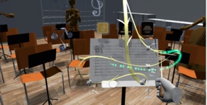
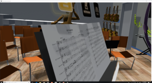
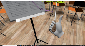
Key assets include a customized UBC baton using Blender, trail guide using GravitySketch, and buttons.


Libraries and Versions
- Unity 2018.4.0f LTS
- Game Engine that Interactive Orchestra is built upon.
- VRTK 3.3.0
- Tool kit used for implementing VR functionality into a scene. Allows easy interchangeability between different VR hardware.
- Tool kit used for implementing VR functionality into a scene. Allows easy interchangeability between different VR hardware.
- Wwise 2018.1.3
- Interactive audio software, used for slowing and speeding up the piece according to the user.
- Interactive audio software, used for slowing and speeding up the piece according to the user.
- SteamVR 1.2.3
- Gives Unity access to SteamVR.
- Gives Unity access to SteamVR.
- Oculus plugin 1.38.4
- Allows Oculus functionality within Unity.
- Allows Oculus functionality within Unity.
First Time Setup Guide
- Make note of Oculus controller: only the grip & the trigger functionalities will be used.
- Adjust headset for user's comfort.
- Ensure that the guide button (above the top left of music stand) is selected.
- Select by making contact with Oculus controller.
- Use grip functionality to pick up baton (resting at the base of the music stand) via baton grip.
- User can let go of the grip button after baton has been selected.
- Press & hold trigger to activate the trail system. The trail system indicates that your gestures are being tracked.
- Move baton tip along prep beat guide to an approximate speed of 80 beats per minute. This will activate the 4:4 legato guide for the user to follow.
- Motion baton tip along 4:4 legato static guide in a smooth motion.
Poster
Development Team
Current Members:
- Dr. Jonathan Girard | Principal Investigator - Director of Orchestral Activities, Assistant Professor of Conducting and Ensembles at the UBC School of Music
- Dr Patrick Pennefather | Principal Investigator
- Dante Cerron - Project Coordinator
- Jaehun Song - Project Coordinator
- Alice Hsiao - UX Designer
- Yousra Alfarra - UX Designer
- Sean Jeon - UX Advisor
Previous Members:
- Julia Zhu - Designer
- Michael Hahn - Developer
- Nikko Dumrique - Developer
- Julie Khashimova - Designer
- Serena Chao | Project Coordinator
- William Beltran | Technical Lead
- Andrea Tang | Technical Lead
- Georgette Espina | Design Lead
- Farhan Kassam | Developer
- Shavonne Yu | Designer
- Angel Wen | Design Lead
- Jessica Wu | Design Lead
- Vanessa Bayubaskoro | Designer
- Michael Goh | Technical Lead
- Jonathan Kay | Developer
- Conrad Sosnowski | Developer
FAQ
To be added at a later date.
Bibliography
To be added at a later date.
License
|
|
