Documentation:UBC Content Management System/CLF Theme/Navigation Options

| UBC CLF Theme Codex | |
|---|---|
| Welcome to the support documentation for the UBC CLF Theme. | |
| Contents | |
|
Theme Options Overview | |
| See Also | |
Navigation in the UBC CLF Advanced theme consists of the top navigation header, breadcrumb navigation, and previous and next post navigation.
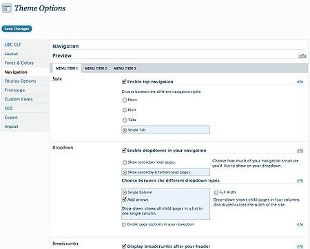
To set your preferences for the navigation, in the WordPress Dashboard, go to Appearance > Theme Options > Navigation and select your preferred options.
The top of the options page contains a preview header which changes according to your selected style, so feel free to explore each option before you save your changes.
The Navigation options consist of four major sections: Style, Dropdown, Breadcrumbs, and Next and Previous Posts.
Style
The Style section allows you to change the look of the CLF top navigation header. There are four styles that you can choose from: Pipes, Plain, Tabs, and Single Tab.
-
Pipes Style
-
Plain Style
-
Tabs Style
-
Single Tab Style
If you wish to disable the top navigation header altogether, uncheck the Enable top navigation checkbox found at the top of the Style section.
Dropdown
The Dropdown section allows you to select the structure of dropdowns in the top navigation header (or to disable them altogether) and allows you to switch between dropdown types.
Check off this checkbox (found under the Dropdown section) if you wish to feature dropdowns in the top navigation header. Furthermore, if this checkbox is checked off, you can select whether you want to: Show secondary level pages or Show secondary & tertiary level pages.
CAUTION: This option is ignored completely if you are using the WordPress Menu Builder for the top navigation header.
Choose between the different dropdown types
This section allows you to choose the presentation type of the dropdown. There are two choices: Single Column and Full Width.
The Single Column dropdown shows child pages in a list in one single column. Furthermore, checking off the Add arrows checkbox for this selection will enable downward arrows to appear on all menu items that have child pages.
The Full Width dropdown shows child pages in four columns distributed across the width of the site.
If you enable this feature, you will be able to add HTML to each dropdown by filling out the Menu Page Caption section found on a menu page's edit screen.
Breadcrumbs
Breadcrumbs are a visual representation of your website's hierarchy leading to the current page. They help orient the user and allow easy acces to any of the parent pages.
If you wish to display breadcrumbs, check off the Display breadcrumbs after your header checkbox.
You can also change the style of the breadcrumb separators as well as the name of the link to the frontpage.
Next and Previous Posts
Previous and next post navigation allows users to easily move from one post to the next in a series of posts. This is especially useful for blogs or news websites where there is a long series of entries to navigate through.
You can choose to enable previous and next post navigation by checking off the Display previous and next post navigation checkbox. Furthermore, there are three default labels you can use for the previous and next post navigation: Previous Post/Next Post, Go Back in Time/Go Forward in Time, and (name of previous post goes here)/(name of next post goes here) (this selection is labeled as Previous Sample Post / Next Sample Post).
If you feel that none of the selection quite fit your needs, you can create your own labels for previous and next post navigation by filling out the respective text fields.