Course:KIN570/TOPICS/Journal Issues/Communicating Results
| Research Methods | |
|---|---|
 | |
| KIN 570 | |
| Section: | 001 |
| Instructor: | Eduardo Naranjo |
| Email: | |
| Office: | |
| Office Hours: | |
| Class Schedule: | |
| Classroom: | |
| Important Course Pages | |
| Syllabus | |
| Lecture Notes | |
| Assignments | |
| Course Discussion | |
COMMUNICATING RESULTS
Statistic analyses are inherent to scientific publications. It's estimated that 50% of published articles have at least one statistical error (Curran-Everett and Benos 2004). In an attempt of improving the caliber of statistical information, some organisms created general guidelines. The most globally accepted was the one provided by the American Psychological Association (APA), through the Task Force on Statistical Inference, that has set a standard nowadays known as APA Style. Others, as the American Physiological Association (APS), provided more specific guidelines regarding to common errors made in their fields of study. However, most journals have specific policies for accepting publications.
Reporting statistics should be an objective process, in which the outputs of the statistical analyses should be clearly presented. Throughout this process, two big questions may arise: What should be reported? How should it be reported? There are no key answers to these questions, but some recommendations based upon the forementioned guidelines can be done.
WHAT SHOULD BE REPORTED?
Design of our study, sample population, variables, procedures for random assignment, estimated statistical power and methods used for statistical analysis. All this critical information should be reported, clearly defined and justified in the Methods section.
In the Results section:
- It’s a common error not reporting complications or events occurred during the analysis in this section. Here we have also to report the violations to our assumptions, and any corrections made.
- In the case of multiple outcomes and multiple comparisons, we shouldn’t only restrict to first-order associations, as Post hoc tests. There’s nothing wrong for communicating high-order, more subjective, associations in data, as trends, structures, and clusters.
- When communicating the results of our inferential tets (ANOVA, T-tests), it's a good idea to organize the sentences by main effects and interaction effects, reporting the F and t values, and significance level.
- Effect size: provides important information and complements significance level. Reporting effect size is an increasing requirement by journals nowadays.
- Report variability using Standard Deviations, which express the dispersion of our data from the mean value. It is a common error to communicate the variability of our sample using Standard Errors.
HOW SHOULD RESULTS BE REPORTED? FORMAT AND APA STYLE
- Italics and spacing: the APA is very strict with the use of spaces and italics in the text. Values should be separated from the sentence by a coma, being the standard style:letter(df,df) = value, p = exact p value.
- Report quantity with a number of digits commensurate with relevance of the measured magnitude.
- For statistic values: 2 decimals, except for p value if is less than .01.
- Mean and Standard Deviation (SD): It’s common to see how SD it’s expressed with ±, but it is a single positive number. They should be presented in parentheses, i.e.: The sample as a whole was relatively young (M = 19, SD = 3.45).
- Report precise p value, since provides more information to assess a result. Only if p < .001 we can use the less symbol.
- Percentages: expressed in parentheses, with no decimals.
- Chi-Square: expressed with degrees of freedom and sample size, in parentheses, and significance level (i.e. The percentage of participants that were married did not differ by gender, c2(1, N = 90) = 0.89, p = .35.).
- T Tests: expressed with degrees of freedom and significance level (There was a significant effect for gender, t(54) = 5.43, p < .001, with men receiving higher scores than women).
- ANOVAs: express F value, with two degrees of freedom (first the between-groups, second the within groups), and significance level (i.e. There was a significant main effect for treatment, F(1, 145) = 5.43, p = .02, and a significant interaction, F(2, 145) = 3.24, p = .04.).
- Correlations: expressed with degrees of freedom in parentheses, and significance level (i.e. The two variables were strongly correlated, r(55) = .49, p = .01.).
- Regression is best presented in a figure. In text we should express the unstandarized or standarized slope (b) with t-test and significance level. Also, the percentage of variance with F value (i.e. Social support significantly predicted depression scores, b = -.34, t(225) = 6.53, p = .001. Social support also explained a significant proportion of variance in depression scores, R2 = .12, F(1,225) = 42.64, p = .001.).
VISUAL DISPLAY OF RESULTS

Tables and figures provide a more clear presentation of information in less space, improving understanding to the reader.
- If you we use a table, we should avoid being reiterative by reporting the same information in the text.
- Ask yourself if the display is necessary. Don’t use a table for expressing small amounts of data that you can easily express in the text.
- Independence and integrity: all displays should be intelligible without reference in text.
- Avoid a misleading appearance. Displays shouldn’t be used for manipulating information. Figure 1 represents a good example of how a graph can give a misleading appearance.
TABLES
Tables summarize data supporting results.

- Structure of a table (Figure 2):
- Number: referenced in the text.
- Title: concise and clear.
- Headings: headings and subheadings, also for each row and column.
- Body: display of data, orderly presented.
Symbols can be added, or bold and italic fonts can be used, in order to express levels of significance or other information. All symbols used must be mentioned and explained by footnotes.
FIGURES
A figure is a visual display that is not a table. Figures must be numbered and also referenced in the text. Graphs or charts are the most commonly used.
Graphs
Express relationship between groups, present comparisions and distribution of data (Figure 3).

- Line graphs: used to express and compare quantitative variables and continuos data. Normally, the independent variable is displayed in the x axis and the dependent variable in the y axis.
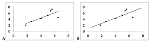
Figure 4. Proper use of a regression line, from the first actual value observed to the last.

- Scatter plots: express correlation with dots. In a scattergram, correlation is shown with a reggression line, which should cover from the first actual value observed to the last. If line extends beyond those values it may lead to unsubstantiated conclusions (Figure 4).
- Bar graphs: express categorical data. Discrete values should be shown in bar graphs.
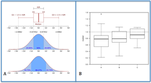
Figure 5. Box Plot. Figure 5A describes what a box plot represents. Figure 5B shows a typical box plot

- Circle graph (pie charts): express percentage and proportion.
- Box plots: graphically depicts groups of numeric data, expressing the median, the upper percentage (75%) and lower percentage (25%) of our distribution. Whiskers are commonly added to show the mínimum and máximum values (Figure 5).
- Other figures:
- Patient flow: shows patient elegibility in clincal trials
- Time-line diagrams: a clear way to show procedures and sucession of events.
- Diagrams, histograms.
- Illustrations: provide what is called Primary Evidence (i.e. a radiography or a picture of a subject in an experimental set-up).
References
- Curran‐Everett D, Benos DJ. Guidelines for reporting statistics in journals. Am J Physiol Heart Circ Physiol, 2004; 97: 457‐59.
- Wilkinson L, Task Force on Statistical Inference. Statistical methods in Psychology Journals: Guidelines and explanations. American Psychologist, 1999; 54: 594‐604.
- Tufte ER. The Visual display of quantitative information. Cheshire (CT): Graphics Press, 1984-2001.
- Publication Manual of the American Psychological Association, 6th ed. Washington, DC: American Psychological Association, 2010.
- Durbin CG Jr. Effective use of tables and figures in abstracts, presentations, and papers. Respiratory Care, 2004; 49(10): 1233–37.
- Zeiger M. Essentials of writing Biomedical research papers. McGraw-Hill (NY), 2000.