Course:ENGL419/Books/ParablesofourLord
Intro to Erin McCabe's Wikipedia page on Henry Noel Humphreys' Parables of Our Lord
I hummed and hawed for ages about choosing a book! I would call a book from RBSC, decide it was fabulous, then second guess it. It was not completely futile however – I learned a whole lot about Oscar Wilde, Jack Kerouac, and Charles Dickens. I stand by the merits of my didactic indecision. Basically it came down to the aesthetics of well-preserved papier-mâché. I'll admit to judging a book by it's cover, but lucky for me what I found inside was equally as enjoyable, not to mention a great space for exploration and research.
About Parables of Our Lord
The Book Itself
Parables of Our Lord. London: Longman & Co., 1847
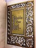
This aesthetically impressive little book presents a series of Christ’s parables from the Gospels – earthly stories told with allegory and analogy in order pass along the teachings of Christ. The colophon states that “in designing ornaments to the sacred parables contained in this volume, the illuminator has sought to render them in each instance appropriate […]” – which I take to mean that Humphreys efforts in illustration and illumination were done with a goal of forging a connection between the literal content and the visual experience. The chromolithograph border and decorative images in this artsy biblical rendition make this piece the most widely recognized example of illumination from Henry Noel Humphreys. Feel free to scroll down for a little biography on Humphreys, and click here to access my Wikipedia page for quick debriefing on illumination and chromolithography. The UBC Library's copy of Parables of Our Lord is in remarkably good condition, much better maintained than a couple of the other pieces of Humphrey’s design that I pulled up. Of the 2000 copies that were printed and bound in Britain, 1000 were sold to Appleton in New York. The widespread international popularity was thought to be a combination of the intricate beauty of a book and the culturally appropriate material.
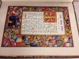
Parables is, for lack of a more scholarly term, an extraordinarily pretty piece of literature. It is small – 16.9 x 11.8 cm and not much more than an inch thick, cover to cover. The black, ebonite-esque binding, much like the illuminations inside, is impressively intricate. The moment I saw the awesome little treasure in the RBSC room I knew it had serious final project potential! What makes it even more intriguing is the fact that it is crafted out of papier-mâché – the same idea as the sticky paste and paper shreds we used to muck around with as kids! The method employed by Humphreys and his contemporaries was a little different, however, both in materials and process. I elaborate on the process a bit further down!

The front cover has “Scripture Parables” written into the papier-mâché with raised Gothic lettering, a visual effect that imitates medieval wooden book covers. The medieval influence extends beyond book style similarity however, with many scholars linking Humphrey’s exposure to Italian medieval architecture while studying art in Italy as a major influence. His design for the binding of A Record of the Black Prince is thought to be a reproduction of one of the compartments of the Prince's tomb in Canterbury.
The spine of the book is made of light leather with three black panels, the format of which I love. The title organization is unorthodox, even by today’s standards, with “Of Our” written in the bottom, base panel, “The Parables” in the middle, and “Lord” in the panel at the head, or top. This irregular word arrangement invites a non-linear, second glance that provides an element of contrast to the somewhat thematically straight-laced piece.
The pages are finished with golden gilded edges, a technique that was often seen in religious works. Read up on it here.

Also interesting to note that pages of the book are not sewn into the binding – as a result, many have come completely detached. Despite the well-maintained cover, the book is dated by the yellowing and stained inner pages.

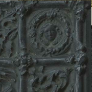
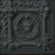
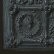
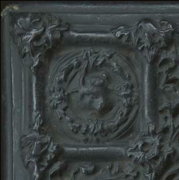
The four corners of the front and back covers have a wreath containing visual imagery; the head of an angel, lion, eagle, and ox – figures that are said to represent the biblical presence of Matthew, Mark, John and Luke.
-
Angel
-
Lion
-
Eagle
-
Ox
Papier-Mâché Book Binding
This was a stylistic method of binding books, popularized in the mid 19th Century, that was intended to imitate the medieval hand-carved bindings. The exact materials used are debated, although it is presumed that the combination was of plaster of sorts, a filler, and antimony (a brittle metal of a flaky, crystalline texture; blueish white and metallic) While these covers appear to be made of wood or ebonite, the materials used were much cheaper, and as a result, a lot more fragile and susceptible to age and damage. For most of the 1840s-1860s, the patent for all papier-mâché bindings was held by the English firm Jackson and Sons.

Alongside the impressive illustration and inventive binding, there is another element of artsy importance: the marbled endpapers.
Marbling
Paper marbling is another prominent method of decorative book design – a liquid based method of surface manipulation that was able to produce patterns similar to marble and other stones. The method is usually to fill a shallow tray with water or a more vicious substance, and gradually add various inks and paints to the mixture. "Negative" colour can be achieved by re-adding more plain water. The colours can be moved and arranged in different ways; blowing them through a straw, fanning the colours, mixing them with split bamboo (Kyoto Master) or even moving the mixture with human hair!
Henry Noel Humphreys [1810-1879] – The Man Behind the Mâché

First and foremost – Henry Noel Humphreys and Doctor Noel Humphreys are not the same person. The latter is a wonderfully accomplished and well travelled man however, someone I would never have had the opportunity to research if I paid fuller attention to first names and prefixes. The real question is how I figured one man could be a naturalist, insect studying, book illustrating, papier-mâché wizard AND a world travelling explorer/doctor in the years following his own death... But seeing as Dr. Noel Humphreys' adventures were noteworthy (and I filled out the pesky RBSC photo permission slip) – here's a pretty wicked map of his travels in Uganda.
The relevant Henry Noel Humphreys [1810-1879] was a British illustrator recognized most significantly for his efforts in the fields of entomology (the study of insects), numismatics, naturalism and book design. He focused a lot of academic attention towards Greek and Roman coins, archaeology, and the art of writing and printing that saw rapid development throughout his life. His compilations reflect his interests, with most of his notable published works centring on either insects, coins, or artistic development and progress. He also had a serious issue with excessively titling the majority of his works (i.e. The Butterfly Vivarium, or Insect Home: Being an Account of a New Method of Observing the Curious Metamorphoses of Some of the Most Beautiful of Our Native Insects, Comprising also a Popular Description of the Habits and Instincts of Many of the Insects of the Various Classes Referred to, with Suggestions for the Successful Study of Entomology by Means of an Insect Vivarium – Is that length necessary?) Many attribute the influence of Humphrey’s design to the time he spent travelling Italy – studying medieval manuscripts and quite likely absorbing copious amounts of architectural influence.
Henry Noel Humphreys : UBC RBSC Holdings
Origin and Process of The Art of Writing [...] is designed with the same style of papier-mâché binding. This book is also black, although the cutaways serve the purpose of showing off the red colouring behind it. Pretty neat effect! This book looks a tad more well-loved, with chunks of the binding actually broken off. As well, the binding of this book was much tighter than Parables, and it was difficult to keep it open to a specific page.
Illuminated Books of the Middle Ages : An Account of the Development and Progress of the Art of Illumination, as a Distinct Branch of Pictorial Orname ; a massive red book that provided a significant contrast to the first two small black books I had been researching. This one had to be 2 x 1.5 feet! As impressive as the size is the beautiful illuminative art inside; an accurate representation of the book's title.
Works Cited
N/A . "Database of Bookbinding" British Libraries. Web 19 April 2015.
Maggs Bros. "Bookbinding in the British Isles: Sixteenth to the Twentieth Century, Part 1". (Maggs Bros LTD: 1996). Web 19 April 2015.
"Mr. Henry Noel Humphreys" The Canadian Antiquarian and Numismatic Journal (Montreal: English and Somerville 1879). Web 18 April 2015.
"Chromolithography Prints – Why they are Considered Originals" The Stock Solution. Web. 20 April 2015.
Wikipedia contributors. "Henry Noel Humphreys." Wikipedia, The Free Encyclopedia. Wikipedia, The Free Encyclopedia, 27 Mar. 2015. Web. 16 Apr. 2015.
http://www.lib.rochester.edu/index.cfm?page=3343#Bindings. Web. 20 April 2015.
http://www.victorianweb.org/art/design/beckwith/introduction.html. Web. 20 April 2015.
Wikipedia contributors. "Paper marbling." Wikipedia, The Free Encyclopedia. Wikipedia, The Free Encyclopedia, 15 Apr. 2015. Web. 21 Apr. 2015.
