Communicating Uncertainty/Using Figures and Images
Using Figures and Images (as well as Words and Numbers)
Some people find it easier to visualize and interpret patterns when they see them in figures and images instead of reading about them in print. The great advantage that figures have over words and numbers is that they can be more effective in highlighting magnitudes of differences between comparisons.
There are a few tips that you should put into practice when producing effective figures (such as keeping them simple, avoiding white space, and using bar graphs where possible – these are easier to interpret than pie charts and scatter plots). These tips and more information can be found by visiting our Effective Tables and Figures resource.
An Example
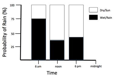
If you write that there is a 75% chance of rain at 6 am on a particular day, then a 35% chance of rain at noon, and a 40% chance at 6 pm, it is not easy to quickly relate to the relative uncertainty of these estimates; how much of a difference is there in these estimates?
The figure below makes this much easier to visualize, and might help you make a more informed decision as to whether you would risk going out without a rain jacket at certain points of the day.
