MobileCourseDiscussions
The desired task: check in on my courses on my iPhone to see if there are any new discussions, and then read them.
First up, a course I teach on WebCT Vista.
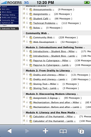
Between the various logins, and menus, It took me about than five minutes of intent hunting and pecking to get to this discussion screen.

I suppose with bookmarking and more familiarity I could get that time down to about two minutes to get to this screen. (Though the system has crashed frequently and forced me to go through the login whole process again to get back to the discussion screen each time.) But the problems don't end there. I don't intend to pick on the platform here, but navigating these menus, while not impossible, is not easy.
- For one thing, all those links are too close to one another for my big clumsy fingers - that's a problem I have with other link-heavy sites such as the New York Times website as well -- though at least I can pull RSS off of most news sites.
- Even when I can cleanly click the links, many of them simply don't respond. I can't figure out why some links work and others do not.
- Frequently, clicking a link to a specific discussion page sends me to a new Safari window to read it. Which would be great, except that when I go back to the window with the discussion menu the entire Safari screen reloads, taking me back to my initial course menu, so I have to navigate back to the discussion board nearly from the beginning of the process (at least it usually remembers my login).
I meant to take more screenshots, but worry about student privacy, and to be honest I'm sick of the crashes and multiple logins. Call me lazy.
I'm sure my own lack of skill with the iPhone is an issue, but I have to say that this system is a half-notch above completely unusable. If courses on this platform will ever be delivered to mobile learners, some sort of redevelopment or 'mobile layer' will need to be implemented. My quick search query turned up this short thread on a Blackboard discussion space, and it seems to confirm my assessment.
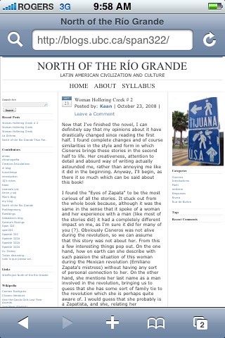
Now, let's compare that experience with an open, weblog-based course. When I go to the URL, this is the first screen I see, the most recent post at the top:

And with one finger-poke get to this detail:

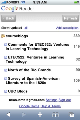
Then there is Google Reader, which is the easiest way to navigate web content via the mobile (that I know of, anyway). Here's a shot of weblog-based courses I am monitoring:

To get from picking up my iPhone to seeing this screen is maybe ten seconds of loading time, and two link-clicks.
And here's a detail shot of one course's discussions...

And to be clear, while there are many free WordPress plugins and themes intended to enhance the mobile experience such as WPTouch, we made no effort to develop a mobile platform. All we have is open access, clean HTML, RSS and a great developer community.
Gotta love RSS!
![]()