Producing Effective Tables and Figures/Specific Tips for Producing Effective Figures
Specific Tips for Producing Effective Figures
1) Simplicity is important. Try to show the main pattern or trend as simply as possible.
- Hint: in many cases, bar charts or scatter plots are the best options, while pie charts are usually bad choices because research shows that people are not very good at comparing ‘slices of pie’; it can be very hard to judge between two groups/categories that are similar in terms of their pie slice, whereas the same comparison is made very easily in bar graph form.
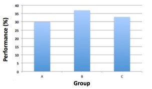
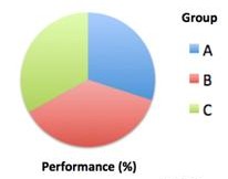
- To show the importance of this point, look at Figure 1 below and see how easy it is to tell which of the three groups (A, B and C) performed best in biology classes when these data are presented in a bar graph; conversely, see how difficult it is to judge when the same data are presented in a pie chart.


Figure 1: Bar Charts are Generally Easier to Interpret than Pie Charts.
The same data are displayed in the two charts but while it is easy to rank the three groups in terms of performance in the bar chart, it is impossible in the pie chart.
2) Label all axes and legends. In Figure 1, note how it is clear what the bars and pie slices represent (Groups A, B and C), and how the data are measured (%).
3) Include white space. The use of white space is an important aspect of design, ensuring elements are properly spaced out to maximize visual communication.